This week Fibich started looking less like an internal project and more like an app that is preparing to leave the workshop.
The biggest symbolic change is simple: the app is now actually named Fibich in the project. Until now, a lot of the codebase still carried the older HiFiPlayer name. Renaming an app properly is not glamorous, but it matters. Names appear in schemes, project files, source folders, entitlements, settings, tests, and release metadata. If the app is going to stand on its own, the codebase should speak the same name as the product.
There was also a small fix for the app icon on older macOS versions. That belongs to the same category: identity should be consistent. If the icon represents Fibich, and Fibich is named after Zdeněk Fibich as a small tribute, it should look right across supported systems, not only on the newest one.
A lot of this week was also about polish. The app background color is now more unified, dark mode striping in the library browser was corrected, activity indicators use a more consistent style, and the project serialization was normalized. None of those changes become a headline feature, but together they make the app feel less rough.
Under the hood, SwiftTagLib moved from a local dependency to a remote package. That is another step toward a cleaner build and release story. Local dependencies are useful during development, but a distributable app benefits from dependencies that can be resolved clearly and repeatably.
The biggest release-oriented step is the new Developer ID notarized release workflow. Fibich now has a script path for signing, notarization, stapling, and verification. That is not user-facing in the same way as playback or playlists, but it is essential for a macOS app that should be shared outside the developer machine. A good player still needs to arrive as a trustworthy app bundle.
There was also a practical playlist improvement after the recent drag and drop work: playlist tables refresh properly after library drops, and library drops are sorted by track number. That keeps album insertion feeling natural. If I drag an album into a playlist, I expect track 1 before track 2 before track 3. The app should protect musical order wherever it can.
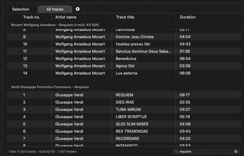
The newest feature is playlist search.
Fibich already has library search, but playlist search solves a different problem. The library is where the whole collection lives. The playlist is where the current listening session happens. Once a playlist becomes large, the user needs to find things inside it too: a specific track, an artist, an album, or a section of a long queue.
This update adds full-text playlist search, a playlist search index, a search model, a search worker, and a visible search field. More importantly, playback navigation now understands filtered results. That is the tricky part. Searching a playlist should not only hide rows visually; it also changes how “next” and “previous” feel while the filter is active.
The app needs to keep two ideas in balance: the real playlist order and the filtered view the user is currently looking at. If search is active, navigation should make sense in that filtered context. But the playlist itself still has its full order underneath.
That is the kind of detail that makes search feel integrated instead of bolted on.
There are also many new playlist tests around this work. That feels right, because filtered playback navigation can easily create edge cases: empty results, changing filters, current track visibility, selection, and playback state all intersect.
So this week’s progress has two sides.
One side is product readiness: the Fibich name, release workflow, dependency cleanup, icon compatibility, and visual polish.
The other side is listening usability: ordered drops, refreshed playlist tables, and full-text playlist search that works with playback navigation.
That feels like a good step for this phase of the app. Fibich is not only gaining features now. It is starting to behave like something that can be packaged, trusted, searched, and used seriously.