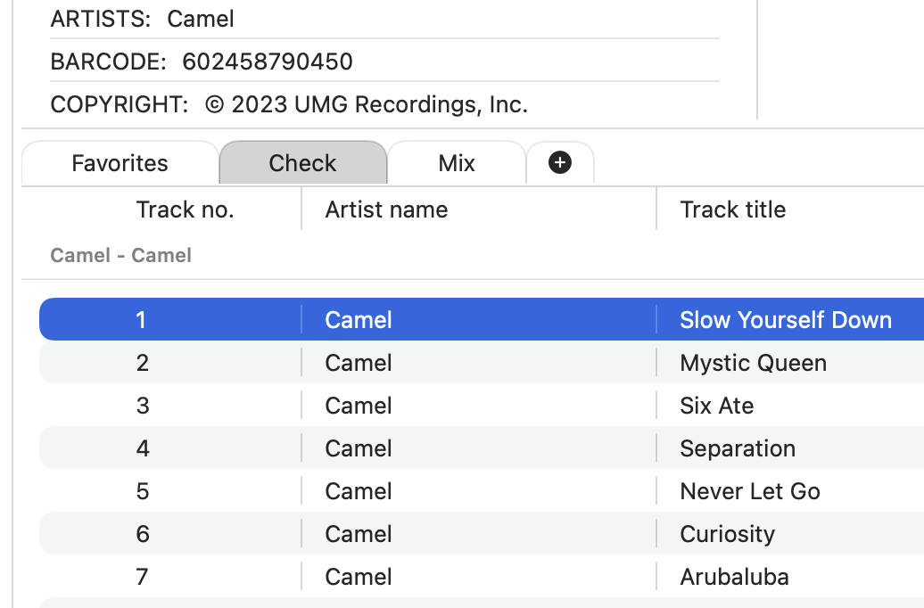
Today Fibich gets a feature that changes the playlist from a single queue into a small workspace: multiple playlists.
Until now, the playlist has mostly behaved like one current listening list. That is useful, but it is limiting. Real listening is rarely that linear. Sometimes you want one playlist for an album run, another for testing new files, another for a late-night selection, another for tracks opened from Finder. A local music player should not force all of that into one place.
The new playlist tab section starts solving that.
There is now a playlist model, a tab view for switching between playlists, and a dedicated area for managing them visually. The important part is not only that more playlists can exist. It is that the app now has a structure where each playlist can become its own object with its own name, items, and state.
Today also adds playlist renaming. This is small, but it makes the feature feel personal. "Playlist 1" is a placeholder. A named playlist is something the user can recognize and come back to.
There was a UI challenge here too. Playlist tabs need to feel compact, clickable, and native enough without taking over the whole player. The first version introduces a custom tab shape and an inline input field for renaming. It is still early, but the direction is clear: playlists should be easy to create, switch, and understand at a glance.
A small bug appeared around switching playlists as well: the view wanted to jump back to the top automatically when changing playlists. That kind of behavior can sound harmless, but in a music app it quickly becomes annoying. If a playlist is long, position matters. The user should not feel punished for switching context.
So today includes a first fix for that scroll behavior. It is a tiny detail, but it belongs to the same larger idea: Fibich should remember enough of what the user is doing to feel steady.
On the code side, this is another step away from "one player, one list" thinking. The player now has to care about the selected playlist, the playlist collection, tab interactions, rename state, and how all of that connects to playback. That adds complexity, but it is the right kind of complexity because it matches how people actually use music.
The result today is that Fibich feels less like a simple queue and more like a place where different listening sessions can coexist.
That is a meaningful step toward durable playlists and better library organization. A hi-fi music player should not only play files well. It should help keep listening contexts organized without getting in the way.