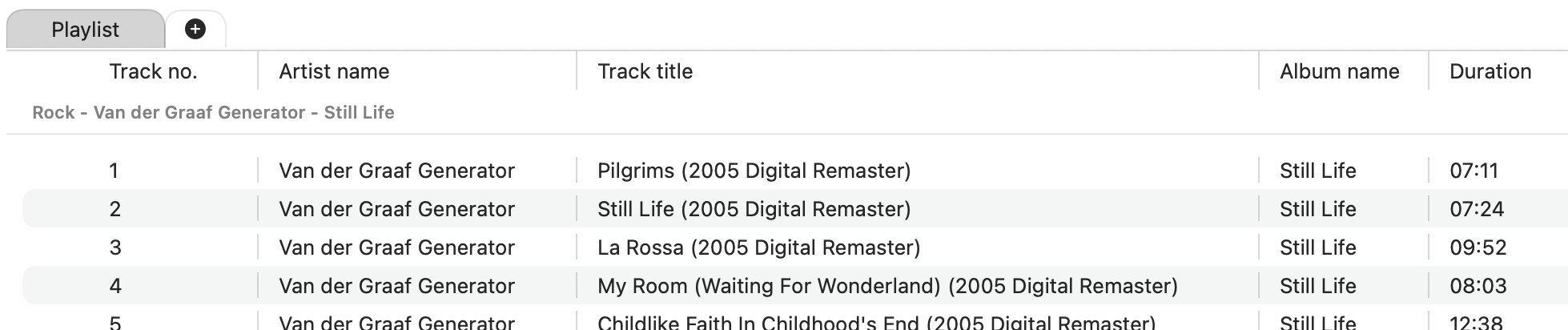
Today I spent time on one of those features that looks small from the outside, but changes how the whole app feels during use: the playlist header.
Fibich already has a playlist, but a playlist only becomes comfortable once it can carry real information clearly. Track names alone are not enough. A useful music player needs room for title, artist, album, duration, maybe format-related details later, and the user should not feel trapped by whatever column width the app happens to choose.
So today the playlist header starts becoming more flexible. It now has slidable dividers, which means the visible columns can be resized. Even better, those values are persisted, so the app can remember the layout instead of resetting it every time.
This is a small promise, but an important one: if the user adjusts the interface, Fibich should respect that choice.
There was also a bit of cleanup around playlist sorting. Some of the sorting work started in the library browser, but the playlist has different needs. A library browser is hierarchical; a playlist is more like an ordered listening queue. Reusing the same ideas too directly would make the code convenient for a moment and awkward later.
So today's work separates the concepts a little more clearly. The library expandable list is now treated as its own thing, and playlist sorting has room to grow in the direction the playlist actually needs. This is one of those code-level obstacles that appears only after a feature starts becoming real: the first version can share too much, because everything looks similar early on. Later, the differences become obvious.
A playlist row is not just a library row in another place. It has a different role. It represents playback order, selection, future queue actions, and eventually more advanced behavior like reordering or multiple playlist management. The code needs to leave space for that.
There is also a new structure around parent folder information, which helps keep library items understandable without forcing every view to know too much about how the library is arranged. That matters because Fibich keeps moving between two views of music: the library as stored on disk, and the playlist as chosen for listening.
The result today is not dramatic, but it is very practical.
The playlist is becoming more readable. The columns can breathe. The app remembers user adjustments. And the code is a little less confused about the difference between browsing a music library and managing a listening queue.
This is the kind of progress I want Fibich to keep making: not only adding features, but making the everyday music-listening flow feel calmer and more deliberate.