This week I worked on one of the parts of Fibich that looks simple, but has a lot of hidden decisions behind it: what information the playlist should show, and how much control the user should have over it.
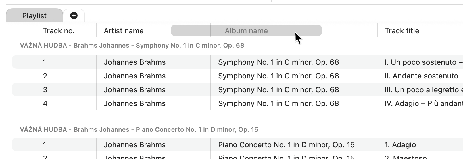
The playlist header has been changing from a fixed row of labels into something more dynamic. Instead of hardcoding every visible column, the header items now come from configuration. That gives Fibich a better path toward showing different metadata fields over time: title, artist, album, duration, and eventually more audio or file-related properties.
The useful part is not only that the app can show metadata. It is that the playlist can start becoming adjustable.
This week also adds drag and drop reordering for playlist header metadata items. In other words, the user can begin shaping the playlist layout around what matters most to them. Someone comparing album versions may care about album and duration. Someone organizing a folder of loose files may care more about title and artist. Later, format, sample rate, or other hi-fi details may deserve a place too.
The code obstacle here was keeping this interaction reusable. Dragging playlist columns is not the only drag behavior Fibich will need. So after the first version worked, I pulled the drag handling into a more general draggable element abstraction. That keeps the playlist header cleaner and gives the app a reusable pattern for similar interactions later.
There was also a practical Finder feature added this week: Show in Finder.
That one feels especially right for Fibich. A local music player should never hide the fact that the music lives on disk. If a track is in the library or playlist, the user should be able to jump back to the original file quickly. Maybe they want to inspect the folder, rename something, compare files, or fix artwork and metadata outside the app.
Adding Show in Finder also touched the library generation code. That makes sense: to reveal a file, Fibich has to keep reliable track of where it came from. The app cannot treat path information as a side detail. For a file-based music player, the connection between a library item and its real location is part of the product.
So this week's work has two sides.
On the surface, the playlist is becoming more flexible: configurable metadata columns, draggable ordering, better header components.
Underneath, Fibich is getting more careful about reusable interaction code and file identity.
That combination matters. A good macOS music player should give the user control without making the interface feel complicated. It should also stay close to the file system, because local music collections are not abstract catalogs. They are folders, albums, files, tags, and years of personal organization.
Today the playlist feels a little less fixed, and the app feels a little more connected to the Mac around it.
That is a good direction.