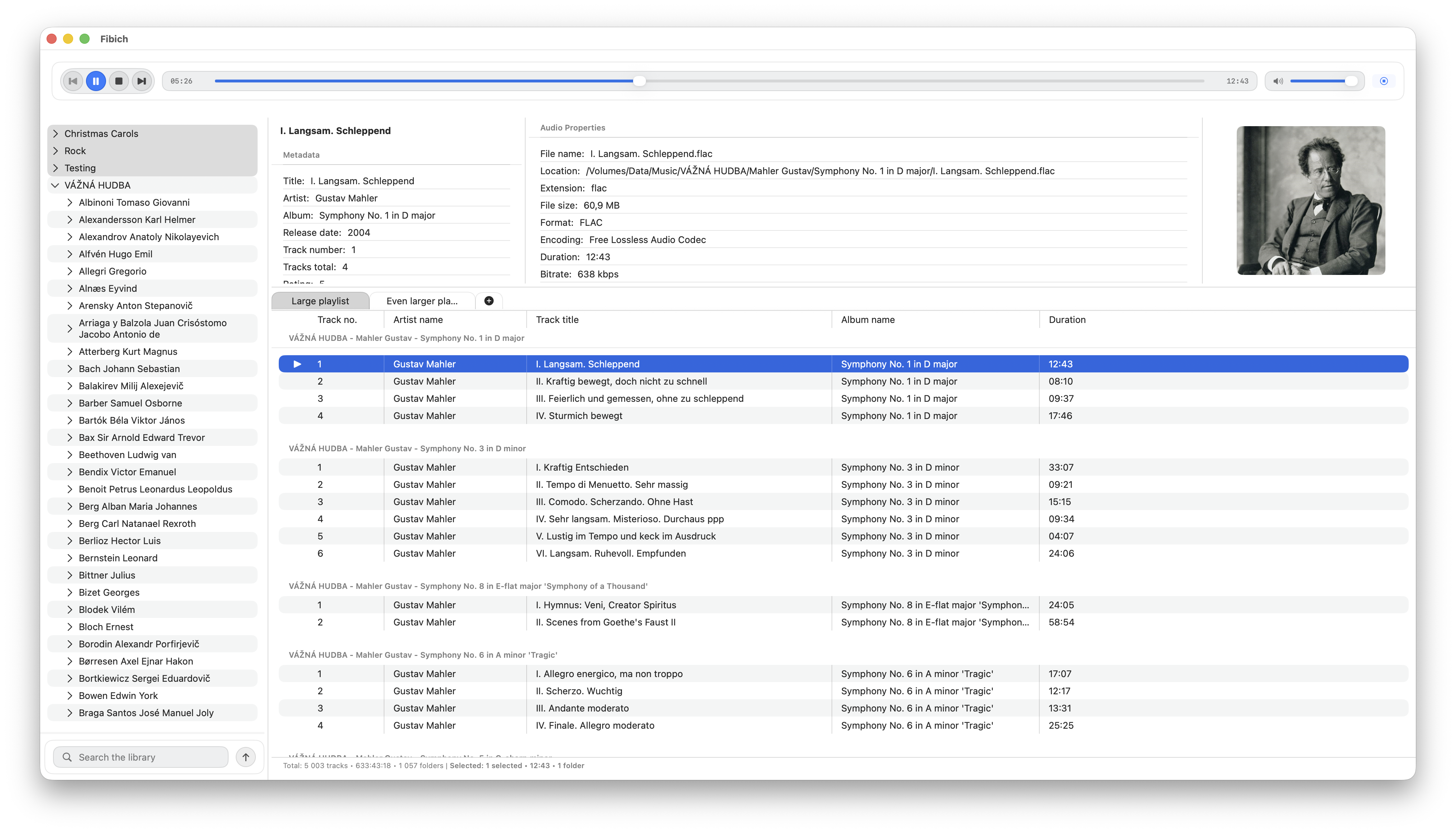
This week was mostly about scale.
Fibich already has playlists, metadata editing, live library sync, artwork, search, and macOS playback integration. But once those pieces exist together, a new kind of problem appears: the app has to stay calm when the music collection is large.
A small playlist can hide many design mistakes. A large playlist cannot.
The first area I worked on was playlist metadata loading and edit persistence. When metadata changes, the app needs to update what the user sees without losing the connection between the playlist item, the library track, and the file on disk. That sounds straightforward, but it is easy for one part of the app to update while another part still shows old data.
So the playlist and metadata flow needed a stronger connection. Editing tags should not leave the playlist stale. Loading metadata should not block basic interaction. The user should be able to edit, return to the playlist, and trust that the visible information is still synchronized.
After that came performance work around playback state.
The problem was that too many parts of the interface were reacting to changes that did not belong to them. Playback state, selection state, timeline updates, metadata loading, artwork, and playlist rendering can easily become tangled. If one track starts playing and the whole playlist behaves like it needs to refresh, the app starts feeling heavy.
This week I began isolating those concerns more clearly. Playlist playback state, selection state, scroll requests, table sections, and presentation snapshots are now more separate concepts. That gives the app a better chance of updating only what actually changed.
A large part of this work was about switching between big playlists. If two playlists contain many tracks, changing tabs should not feel like the app is rebuilding the world from scratch. The playlist now has a more focused presentation snapshot, which helps separate the stored playlist data from the shape needed for display.
There were also smaller usability improvements with the same theme. Playlist scroll positions now persist across launches, so the app can remember where the user was. Cmd+A now selects all items in the library or playlist, which is basic desktop behavior but important for a Mac app. The player view model also went through refactoring to keep the growing responsibilities under control.
Search needed attention too. Slow typing in the library search could freeze the interface, so the library browser gained a search index and better list projection tests. Search should feel instant, especially when it is used to navigate a large local music collection.
Layout got some care as well. Narrow window sizes exposed clipping problems in the playlist and player area. That kind of bug matters because a music player may live beside other apps, not always in a wide full-screen layout. Fibich needs to adapt without making the playlist unreadable.
The biggest reliability fix this week was around realtime track moves.
When files move on disk, Fibich now works harder to preserve track identity, refresh playlist grouping, avoid “missing path” ghosts, and repair stale or duplicate catalog records from older versions. This is exactly the kind of edge case that separates a simple file browser from a durable music library.
A user should be able to reorganize folders without the app losing its mind.
That is the deeper goal of this week’s work: make Fibich more resilient. Large playlists should switch quickly. Metadata edits should stay synchronized. Search should not freeze. Layout should hold together. Moved files should not break the library.
None of this is as visible as adding a new button, but it changes how trustworthy the app feels.
A hi-fi music player is not only about audio quality or format support. It also has to respect the size and messiness of real music collections.
This week, Fibich became better at that.